Thursday 26 April 2012

Evaluation Question 7

Looking back at your preliminary task, what do you feel you have learnt in the progression from it to the full product?

I feel that looking back from my Preliminary task i have improved on my use of Adobe Indesign. 

I first did a Preliminary task, which was to create a magazine for my school sixth form, which is Trinity School. It was quite a simple task for me because it wasn't meant to be as perfect as my final product would have to be, but I still did try my best and did as much as I can to make it look professional as possible. I learnt how to play around with the colours, gradient, fonts and blending options to give my first magazine a good look and suitable for school.


This is my front cover of final project compared with the front cover of the preliminary task. They are both very different as you can tell...


The colour choice is different, as well as the way I have presented both of the front is hugely different. The school magazine looks amateur compared to my music magazine.


Here are the Contents pages for my music magazine and my school magazine...


 The contents page for the preliminary task wasn't delivered as well as my music magazine and the layout was just too simple and not eye-catching compared to the music magazine which I spent a lot of time developing.


Time management was very hard during to stick to during this project as I had so much to do. The preliminary was quite rushed and at the end i wasn't happy with my outcome so I made sure that my final product I was ready and prepared for the challenge. In the main task, I spent a lot of time researching and planning, this helped me to achieve a fair better outcome than I felt after my preliminary task, where as the preliminary I had around a week to take photos and do research. 

To conclude, the outcomes of the final project task was much more appealing than the preliminary, which I think showed a big improvement in design, and also showed my progress of how I adapted to Adobe InDesign which at the start of the year was a new software for me. I know feel that if I was given the same task again to complete in the same amount of time, it would be better as I would have the skills and research to back me up. 

Evaluation Question 5

How did you attract/address your audience?


To attract my target audience, I considered many things which I think would benefit my research into why the desired audience would buy my magazine. This includes the magazine genre, the aesthetics of the magazine (house style), the way it connects with the audience, what the content features and how much each copy of the magazine will cost. I will explain how the following features of my magazine attracts my target audience.

GENRE

The genre of my magazine is Urban, which is mainly focusing on targeting the rap and hip-hop lovers of the UK. The magazine includes artists who are in the Urban scene and also involves what kind of activity/news is going on in that particular part of the music industry. The Urban music industry mainly attracts the younger generation of the United Kingdom, ranging from the ages of 16(where teenagers start to consider and choose what kind of music culture they want to fit into) all the way to 22 years old.

HOUSE STYLE

The overall aesthetics of the magazine is a main attraction to anyone buying the magazine, because I want my magazine to be aesthetically pleasing, the presentation of a magazine is the most important into attracting all audiences before the target audience. The front cover I did features an edited photo of a well dressed male posing for an Urban magazine, big text size and good font choice which will make it easier for the reader to understand and see what exactly they are going to buy, and also the colour theme which corresponds to the 'mise en scene' of the model on the front cover, which will be eye catching for the audience as everything is laid out evenly and attractively.

LANGUAGE

The language my magazine features is informal yet mostly understandable by most readers, especially the young generation. It also involves a lot of American and UK slang words which are related to Hip-Hop. There are a lot of different language techniques of different words and sentences in this magazine, but one thing that it has in common is that it is all related to hip-hop and the Urban scene, so therefore that particular desired audience will understand, which is the main thing.


CONTENT

The content in my magazine is one of the most important aspects that will keep my audience glued to the magazine. My content includes interviews, gossip, gigs, concerts and competitions that are all related to the Urban genre, which will satisfy the desired target audience. The contents page features everything that will please a reader of the magazine, it has pictures and artists that will be eye-catching for the reader to look out for. The double page spread also has the artist on the front cover which will be one of the main reasons the target audience will buy the magazine, because of what they see on the front cover so that is something to keep them attached to future editions. 


PRICE

The price is one of the most important factors of my magazine as it will decide whether it is worth buying the magazine. My price for my magazine is £3.99, I believe this is a reasonable price for a monthly magazine, because it features around 80 pages of music related topics and is out once a month. 

Evaluation Question 2

How does your media product represent particular social groups?

My media product represents particular social groups in the niche market of Hip Hop. The images used in my media product are mainly dark skinned, Afro-Caribbean young females. I choose to have more women in this magazine because I wanted it to be a Hip Hop magazine for women to read but men to gaze at because of the images used which would attract men. I was hoping to brand fill what wasn't currently out there and be unique.

This hyperlink will show you what another media student has commented about my media product, addressing the question above.
http://www.youtube.com/watch?v=zJBRqzJGP9s&feature=youtu.be


Monday 23 April 2012

Evaluation Question 1

Question 1: In what ways does your media product use, develop or challenge forms and conventions of real media products?


What I have produced so far, as in my front cover, contents page and double page spread I feel was a good attempt of trying challenge forms and conventions of existing music magazines, however I don't feel that I developed my work enough to be at a standard where it could be gone to bed. Though in this post I compare my final product with a various of Hip Hop magazines that inspired me and helped me to progress during this task, as well as pointing out the odd risks I took at trying to be different in order for my magazine to have a unique appeal.  

Front Cover

I'm going to compare my final product to existing well known magazines in the industry, using each aspect of the front cover, contents page and spread and show how I incorporated these elements in my own.


This is the masthead for my cover 'Vybz' and for 'Vibe' magazine. During my research and production of my magazine cover 'Vibe' has been a inspiration to me and I like alot of the elements of the magazine, especially the simplistic layout, which I to be more acttractive to an audience then too much going on because it can confuse the reader.

I used a sans serif font because its a convention on covers, so that the masthead stands out to the reader. The font I choose to use was Impact  because I knew it was a bold type font and would stand out on the cover.

I felt it was important to have the key image over lapping on top of the masthead, a I noticed during my research all of the key images overlapped. I think this is to show how the audience will know the title of the magazine, therefore they can take risks and cover the masthead, I used this element but I restricted from covering too much of the character Y because of the fact that this is a new magazine and you won't be able to see the Y which is in a different font to the rest of the word.


The key image for both magazine have an attractive looking female, they are both Hip Hop magazines and having an appealing woman on the front attracts the opposite sex to the magazine known as gaze theory. The pose in both of the magazines is seductive and I actually photographed my model to do the same pose as the model in 'KING' magazine because I liked how it fit in with the genre as the females both look strong as well as sexy.

Strapline from 'The Source'
Straplines from 'Vybz'


The straplines from 'The Source' & 'Vibe' helped me to understand how important distance between each strapline matters, as it inicates to the reader that there is a new story. The weight of the text, font and colour, varies according to the importance of each story.
Strapline (1) from 'Vibe'
The lead is also important to be established and normally is the key image of the cover so that the reades pick up quickly who the lead will be targeted at. For example, the cover for 'The Source' you can see game is in Bold bright red and he is the key image. I used this convention in my own cover with the 'Estelle Cooper'. 
Strapline (2) from 'Vibe
The 'Vibe' magazine strapline I like because the colours stand out which is why I choose to use a pastel colour (yellow) and the pink which compliments the models dress.


The artist line up is at the bottom of my magazine and it was at the bottom of the magazine 'Rap Up' which is above but it is not conventional to be at the bottom but I choose to put mine at the bottom because the bottom of my page was bare. The font isn't really the same as the one in 'Rap Up' this definately shows how I didn't really refer back to my research during production of the line up. However, the fact I used a line up is a convention because all Hip Hop magazine that I reasearched before the development stage incorporated a line up of artists.

Contents Page


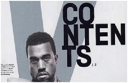
The masthead for 'Vibe' is similar to my one 'Vybz' because I liked to V and the layout of the contents I chose to portray on my own was different and I think more effective because instead of overlapping it is slanted in a position so that it compliments the direction of the V charcater.

The colour of the font had to be pink so it would go with the house style of the overall magazine layout, which is mainly pink in this edition. I also put effects on the 'conents' so that it wil stand out to the readers.


The contents page on the left is from Hip Hop/Rap magazine 'XXL' the middle is from my Hip Hop magazine 'Vybz' and the one on the right is from 'Kerrang'.

I incorporated elements mostly from 'Kerrang' magazine because there were a lot of different images going on. Although, having multiple images on the contents page was not a convention in my genre magazine, which you can see in my research. However I wanted to use that idea so that my contents page wouldn't look limited.

The colour coded images with the story on the contents text I feel will help the readers be able to identify which story is in each catergory and the pagintaion is laid out in a way that readers will be able to understand.


Double Page Spread


The double page spread for my magazine 'Vybz' is more like an interview, whereas the on of 'Lily Allen 'is an article from the music magazine 'NME'.

Similarites are the quotes from the artists, though, 'Lily Allen's' is more a headline and the one in my magazine is just like a sub-heading. The headline for my spread is above the mug shot of the artist and in bright pink like on the cover of the magazine indictated it is the lead.

The font of the copy is in roman a serif font beacause it is a convention to have the copy inside a magazine as roman. The questions are in a different colour to the reported response, to allow the reader to recognize the difference between the question and response from the artist.

The introduction is bold so that the reader can notice it and if they are interested by the headline they will then read the introduction to get a sense of what the main body text will be about.


Sunday 15 April 2012

Magazine Research- Double Page Spread

Magazine Research- Double Page Spread Analysis


For my double page spread, I will be researching through lots of different types of music magazine spreads. Even though my magazine is mainly Hip-Hop and Rap, I will be looking at as many different double page spreads as I can because I want a unique double page spread that isn't similar to other hip-hop magazines. 


This is a double page spread from the magazine 'NME' about the rap artist "Lily Allen". The page features an A4 picture of Lily Leaning forward with her hands on her hips. She has a checkered red shirt on, with her hair jet black scruffy looking and heavy eye make up, which is relevant to rock, which is what the magazine is mainly aimed at. The article is aimed at the public, kind of like a 'cry out' telling the readers she is not an attention seeker. The body copy is her telling how she feels about the matter. The headline  is bold and some letters are made bigger, this will attract the audience because it not conventional. The background colour is greyish which is simplistic and it also make the headline and the key image stand out. There is not too much to read which would make readers more likely want t read the whole article. 


This double page spread was taken out of an 'Now' magazine and its about the famous "Solange Knowles" and her establishing herself as Solange and not Beyonce. The thing that catch my eye when I first took at look at the spread was the background pictures behind the main photo. They involve Solange posing differently shot, which catches the readers attention. The layout of the body copy is composed  so it is easy to read and follow on with the story. The colour scheme for the spread is simplistic and quite dull, other than the bright red dres Solange is wearing and the aqua coloured font displaying her name. The reason behind using that colour font is so that her name stand out amongst the black ordinary font. The weight of the text in her quote is heavier so that readers straight away go to look at what she says which will in the hope draw them to read the story featured.


This magazine double page spread is from 'Kerrang' about a rock band. I like this double page spread beacause there are alot of different images to look at the images are all taken in different locations. The body copy is quite short but is easy to read and would more likely attract readers as there is not too much text to take in. The background colour is black which fits the genres conventions as it is a spread in 'Kerrang' which is a mainly Rock magazine. The body copy text colour so that it stands out on top of the black background. The headline is Bold and the weight of the font is heavier than the sub-heading to attract the readers, the fact that some of the headline is in white and some in red makes it stand out and catch the readers eye. 


This double page spread is about the most famous pop artist at the moment, "Lady Gaga". As you can see from the double page spread, the writing is a lot to read but thats not what is noticable in this, the noticable feature is the big 'L' in the middle of the article which readers will see and recognize that its about Lady Gaga. The picture of Lady Gaga plays on gaze theory as she looks appealing and its a sexual pose where she is holding her breasts, emphasizing the fact she has minimal clothes on which would appeal to male readers. The only colour on the page is from the big red 'L' the body copy is black and there are three columns of text, though all in all the spread is fairly simplistic with the colours used and the composition


Fonts for my Hip Hop Magazine Masthead


Fonts 


During the development stage I thought of some possible mastheads for my Hip Hop  magazine, then I used fontspace.com and the fonts on adobe Photoshop and asked during a focus group which masthead was preferred. During the focus group the feedback I recieved was to use Vybz as my masthead. I knew the font of the masthead had to be sans serif , so that it could be noticed from afar. However I liked the edginess of intertwining sans serif and serif, so I experimented and took a risk using a lower-case 'y' and making it a different font to the rest of the masthead which I used Impact Bold.

My final version of the masthead for my music magazine is:


This masthead is perfect for my genre choice because it ties in well with the conventions of the hip hop genre as well standing out and establishing to the audience what the name of the magazine is called.

Original Photography