 The first analysis I am going to do is the Indie/Rock magazine NME which stands for New Musical Express.
The company that produces the magazine is IPC Media.
The target audience for NME is mainly male with the target age from 16-34 years old because of the fonts which are sans serif and bold, colours used such as; sepia, dull blacks and greys. The audience are music fans around the UK and Europe, mainly featuring topics around Rock artists and bands and is also specialized in rock music reviews and features so it is a niche market magazine.
The magazine is published on a weekly basis. A copy of the magazine will cost a UK customer £2.40.
The monthly revenue for the magazine in 2011 was approximately £325,200 just for the copies of the magazine being sold.
NME Cover

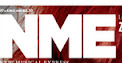
The title of the magazine is "NME" which is a well known name in the music magazine industry in the UK that works with music artists and albums. Therefore the name connotes this popular music brand "New Musical Express".
The title logo consists of three big bold letters which represent the "NME" music magazine brand, this helps the magazine immediately attract an audience's eye. The letters are sans serif so that they are clear to comprehend straight and take up a little space in the corner of the cover. The white colour font is easily recognized infront of the key image's bright red hair. The logo also co-ordinates with the headlines on the cover because they are also white to attract the reader.
 The cover lines on the front cover are there to attract the reader and make them want to buy this issue. This particular issue wants the audience to buy the magazine to find out why FLORENCE: "I would never have got through the X Factor auditions" It makes the audience curious of why she is talking about X factor.
The typeface is all the same the throughout the front cover, with the font used "ARIAL" the the coverlines serif font.

The key image/ main image on the front cover of this issue is a close up is of "FLORENCE" solo artist. Her iconic red hair glows in contrast with her pale/fair skin and grey eyes. Her pose is natural looking with her mouth slightly open, her eyes look engaging and they pull you in. She has a very model, different look about her and her bone structure is amazing. This would attract the audience as the magazine is mainly for men and she has gaze theory as she is attractive. I will incorporate the idea of gaze theory in my work because of how the idea of the woman close up and at the front of the magazine will attract readers both male and female.

 The house style used by NME is quite simple and it appeals to the indie music genre audience. Compared to magazines like "VIBE" who is aimed at RNB lovers and "KERRANG" appeals to rock fans has little writing on the front cover compared to Vibe and NME.
I am going to do my second analysis on the American R'n'B magazine "vibe"The reason for this choice is because my final magazine will be on the genres Rap and Hip-Hop, therefore "Vibe" is a really good choice because it always contains information and articles about music from that genre.
A copy of the magazine will cost a UK customer about £3.30.
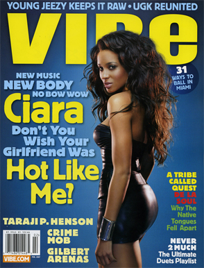
Vibe Cover

The masthead is called "VIBE" which is a music and entertainment magazine founded by producer Quincy Jones. The magazine predominantly features Hip Hop & R'n'B music artists, actors and other entertainers.
The key image of the magazine is the hip-hop artist "Nicki Minaj". The photo shows a mixture of attitude, posture and her character. The facial expression shown looks a bit seductive with her tongue on her top lip as if she is going to lick her lips; as she is portrayed to be a very seductive woman and this would apply to gaze's theory because this could attractie to men, therefore its promoting her sexuality. This has also directed his posture which is a forward pose with her legs open, hands on the hip and chin up, which is most likely to show the confidence that heroes posses and how they think they are the best.

 The clothing worn by the artist looks very bright and compliments the house style colours used in this edition, but it is her own style, therefore she shows off her "Swagger" as she is also known as "BLACK BARBIE" and the conventions of barbie are very much bright colours and a lot of PINK. The clothing also looks like an hero outfit with the maid outfit and high shinyb oink boots and big shoulders which would replace the cape. The outfit she has on applies to the strapline of the superwoman. The orange wig is the only colour that isn't over used which makes it stand out infront of the white and pink dress and it blends in with her skin colour.
There are no other images on the front cover, this is noticable on most Vibe magazine covers because they only feature the main artist at the front. However the magazine uses a lot of straplines e.g "EXCLUSIVE" which will automatically attract an audiences eye because of the fact that it is highlighted in pink with the font white so it stands out more and the fcat that "MICHEAL" is in BOLD black and "JACKSON" is in a pink unhighlighted so because their are colour differences and weight of the text makes it more appealing to an audiences eye.
Language devices I can see on the front cover are uses of alliteration, upper case and bold letters and font colour change. The cover engages with the reader with quite formal mode of address because there is no sign of informal language. It wants to tell the audience that what they have is a major record selling artist on the front, and that they have stories about that artist, almost as if to persuade the audience to hear the story they have heard.
The colour scheme of the magazine is mainly Pink, White and Blue. The font is a mixture of Black, White and Pink as you can see in the cover above, the Pink is mainly used on the name of an artist or topic and it is normally in bold font, while the white and black used to represents something else that is linked to the artist or topic. I think Vibe used this colour scheme because it goes with the background of the photo which is mainly a bright colourful pink and white which compliments the key image's style in fashion.

The features that I used in my preliminary task are some conventions that I would like to incorporate in my final piece like the use of NEW! which stands out and will attract the audiences eye. However, there was some restrictions in my preliminary task as it was for a school magazine so I couldn't change the colour scheme as it had to be applied to the scheme of the school. I used a code and convention from the well known magazine "Cosmopolitan" and interpreted the ending to make t appropriate for my school magazine.
Click on the link to view my short prezi highlighting conventions in music magazines, fashion magazines and my preliminary school magazine. http://prezi.com/7s-mza9cgagb/edit/#2_2256811
The typeface of the font around the magazine is mainly all in a Sans Serif font . The font is clear to read and easy to understand.

The features that I used in my preliminary task are some conventions that I would like to incorporate in my final piece like the use of NEW! which stands out and will attract the audiences eye. However, there was some restrictions in my preliminary task as it was for a school magazine so I couldn't change the colour scheme as it had to be applied to the scheme of the school. I used a code and convention from the well known magazine "Cosmopolitan" and interpreted the ending to make t appropriate for my school magazine.