For my double page spread, I will be
researching through lots of different types of music magazine spreads. Even
though my magazine is mainly Hip-Hop
and
Rap, I will be looking at as many different double page spreads
as I can because I want a unique double page spread that isn't similar
to other hip-hop magazines.
This is a double page
spread from the magazine 'NME' about the rap
artist "Lily Allen". The page features an A4 picture of Lily Leaning forward with her hands on her hips. She has a checkered red shirt on, with her hair jet black scruffy looking and heavy eye make up, which is relevant to
rock, which is what the magazine is mainly aimed at. The article is aimed at the public, kind of like a 'cry out' telling the readers she is not an attention seeker. The body copy is her telling how she feels about the matter. The headline is bold and some letters are made bigger, this will attract the audience because it not conventional. The background colour is greyish which is simplistic and it also make the headline and the key image stand out. There is not too much to read which would make readers more likely want t read the whole article.
This double page spread was taken
out of an 'Now' magazine and its about the famous
"Solange Knowles" and her establishing herself as Solange and not Beyonce.
The thing that catch my eye when I first took at look at the spread was the background pictures behind the main
photo. They involve Solange posing differently shot, which catches the readers
attention. The layout of the body copy is composed so it is easy to read and follow on with the story. The colour scheme for the spread is simplistic and quite dull, other than the bright red dres Solange is wearing and the aqua coloured font displaying her name. The reason behind using that colour font is so that her name stand out amongst the black ordinary font. The weight of the text in her quote is heavier so that readers straight away go to look at what she says which will in the hope draw them to read the story featured.
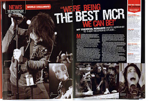
This magazine double page spread is from 'Kerrang' about a rock band. I like this double page spread
beacause there are alot of different images to look at the images are all taken in different locations. The body copy is quite short but is easy to read and would more likely attract readers as there is not too much text to take in. The background colour is black which fits the genres conventions as it is a spread in 'Kerrang' which is a mainly Rock magazine. The body copy text colour so that it stands out on top of the black background. The headline is Bold and the weight of the font is heavier than the sub-heading to attract the readers, the fact that some of the headline is in white and some in red makes it stand out and catch the readers eye.
This double page spread is about the most famous pop artist at the
moment, "Lady
Gaga". As you can see from the double page spread, the writing
is a lot to read but thats not what is noticable in this, the noticable feature
is the big 'L' in
the middle of the article which readers will see and recognize that its about
Lady Gaga. The picture of Lady Gaga plays on gaze theory as she looks appealing and its a sexual pose where she is holding her breasts, emphasizing the fact she has minimal clothes on which would appeal to male readers. The only colour on the page is from the big red 'L' the body copy is black and there are three columns of text, though all in all the spread is fairly simplistic with the colours used and the composition.


No comments:
Post a Comment